Web Design & Development
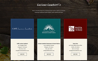
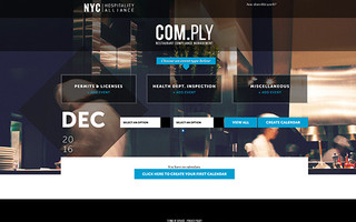
Responsive Web Design
Think outside the desktop.
Responsive design is a relatively new approach to web design. It allows your website to adjust to whatever device your audience is using, be it a tablet, smartphone or desktop computer.
Using an adaptable layout that changes based on the proportions of your screen, a responsive website will expand or collapse content, ensuring a website’s functionality and navigation is properly executed for all content mediums.
A responsive website allows for a user experience that’s similar to an app or mobile site, side-stepping high development costs that come with designing a separate, mobile website or app for multiple platforms.
One important advantage to responsive sites is that they always have the same web address regardless of the user’s device, leveraging your content for SEO and making your website more visible to consumers, since Google will only have to crawl and index one site for your business.
In fact, Google actually recommends responsive design as an industry best practice.
Let us know you’re looking for a responsive website when you contact AYC Media.