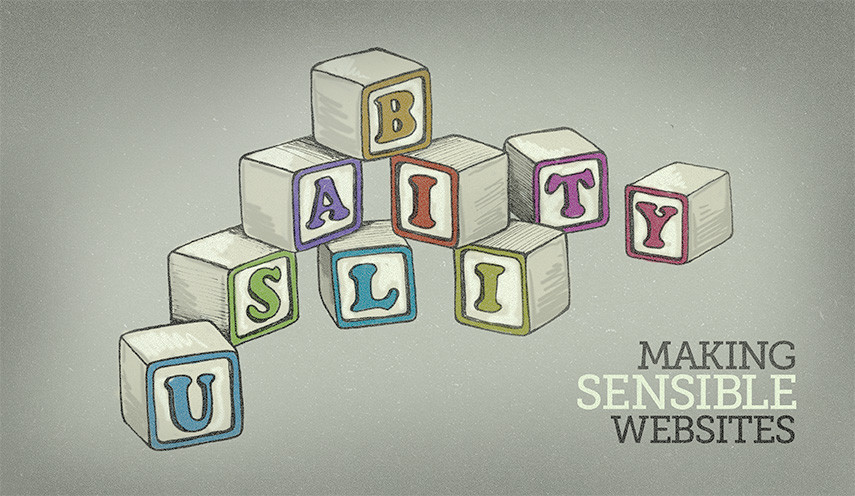
Usability: Making Sensible Websites
Published:09/09/2014

A website can be beautiful, or it can be fun and interactive, but if you can’t get to where you want to go, what’s the point? Usability is one of the most important aspects to consider when building a website, and there are several steps we take at AYC Media to make sure our websites function seamlessly for both our clients and their users.
When it comes to websites, content is king. So it’s a good idea to not get in the way of users and their goals. That's why it’s very important to use clear and bold call-to-actions. These are usually buttons or images that entice users to perform some type of action, whether it’s filling out a contact form or viewing specials on a menu. All of these actions will vary depending on the client's specific goals, but one common denominator is the need for these buttons to stand out, translating visits to conversions.
Call-to-actions are just one piece of the puzzle when it comes to funneling users and providing them with the information they need. Users expect to some of the same components on all the sites they visit, which is where patterns come in handy. Website patterns (or user interface patterns) include having a horizontal navigation at the top of the page or using tabs to conveniently separate portions of content. By developing sites with patterns in mind, we can create websites that users recognize how to use and thus make it easier for them to complete their goals.
Traditional patterns are very helpful in presenting a welcoming website, but sometimes they need to be expanded upon to create a great solution for a user's specific need. This could involve using a custom designed file upload field or using a calendar to select a specific date for an event. The idea is to think about what the client wants and how we can make it easier for the user to get there.
We also aim to serve all users with a variety of needs and resources. This is why we follow best practices, including always using title and alternative text tags for links and images, defaulting to sans-serif fonts for enhanced readability and testing on multiple devices and browsers just to name a few.
Mobile use is only increasing these days, so a lot of the methods and standards already mentioned need to be aimed for mobile and tablet users as well. It no longer makes sense to design and develop strictly for "the cursor." Many websites will be seen on devices that require a touch of a finger or a click of a button on a controller. There are small viewports, horizontal viewports, large viewports–all of which need a "responsive" approach. We aim to develop for a myriad of layouts and devices, guaranteeing a painless experience no matter how the site is viewed.
The web is always evolving and changing. That’s why it’s important to stay ahead of the user's needs and expectations. By considering actions a user needs to take, common patterns they might expect, and perceiving environments in which they might visit a site, we can stay ahead of the curve.
Posted in Front-End Developement
Tagged Web Design & Development
